Brad Vetter and Adrienne Miller
Designer and letterpress printer Brad Vetter and fine artist Adrienne Miller came to give a letterpress and risograph workshop for creating interesting, experimental designs with type for posters. We were told to group up with another peer to design a couple posters on a template supplied by Brad that reads "Graphic Design and Illustration and School of Visual Art and Design" with an empty white space in the center in which we were instructed to fill with type. These posters were mockup ideas for ones that could be placed up for the 100th year anniversary of the art school which will be in 2025.
My peer and I, Marlee Atkins, created a couple of posters. One reads SVAD but is upside down and in a deep red. We created this buy creating our letters with the press machine, and then using x-acto blades to cut out the letters in a collage form. We then arranged these in a scattered, abstract way and cut up some other shapes to use around the letters in the same format. This was a lot of fun to place together.
Our second poster we created was a tad more experimental, although it could be a toss up, as we used the letter press again to this time spell out "Pencil B*itches". We used unusual shapes for some of the letters such as punctuation marks or numbers, and then added our touch of doodles surrounding all of this. We liked that this one had the distinction of the "C" being used as the needed letter in both words by enlarging it in the center.
This workshop taught me a lot about experimental poster designing and how collage work, textures, and unusual type are rather captivating.


Unusual Things
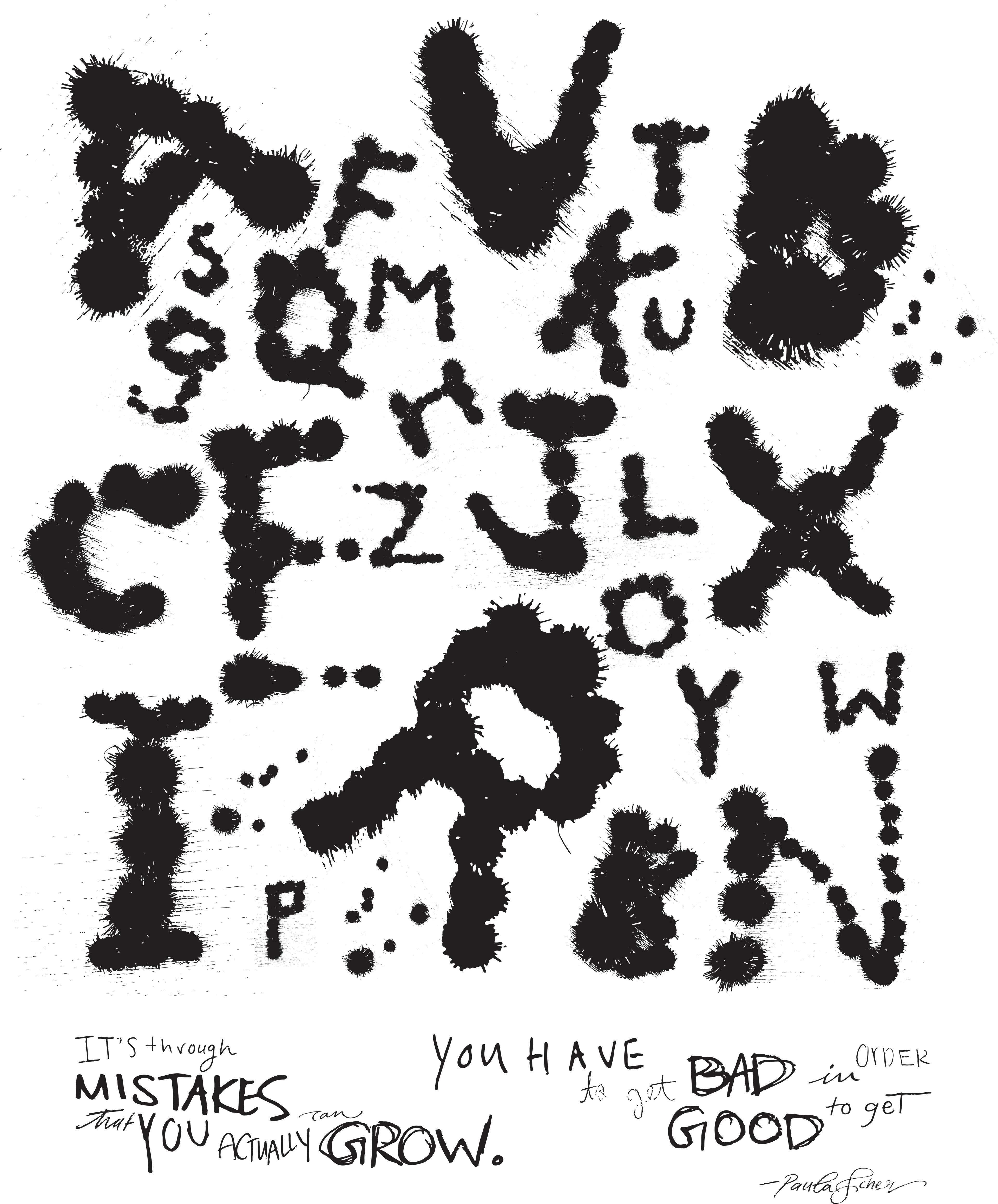
For this workshop we were assigned again to a peer collaboration in which I collaborated with Marlee Atkins. We were excited that this was our first project collaboration together. This project entailed creating an experimental depiction of the alphabet using an object that you may not normally do this with. This was meant to challenge how we look at objects and how we view them differently when we are seeking to build something out of them. Our objects were purple and pink sparkly pom poms. Using these, we created our alphabet and photographed each letter. We were doing uppercase or lowercase and sizings by random as we didn't want it to look like it identical. We scanned each of these into Illustrator and worked here to arrange the letters in our desired way. After arranging them how we wanted we distorted them to where the sparkles of the pom poms appeared as ink strokes or stamp-like. We felt this held a captivating grunge appearance.
The last component was choosing a quote underneath the Unusual Things list to pair with the imagery. We chose one by graphic designer Paula Scher that reads "It's through mistakes that you can actually grow. You have to get bad in order to get good". We did one version with a typeface, but then saw it as hand-rendered where we took turn writing words in both of our styles and liked this a lot better. This quote felt rather fitting after completing this project because you have to work through trial and error with most design processes to get to the result you're wanting or in other words, get bad before getting good. 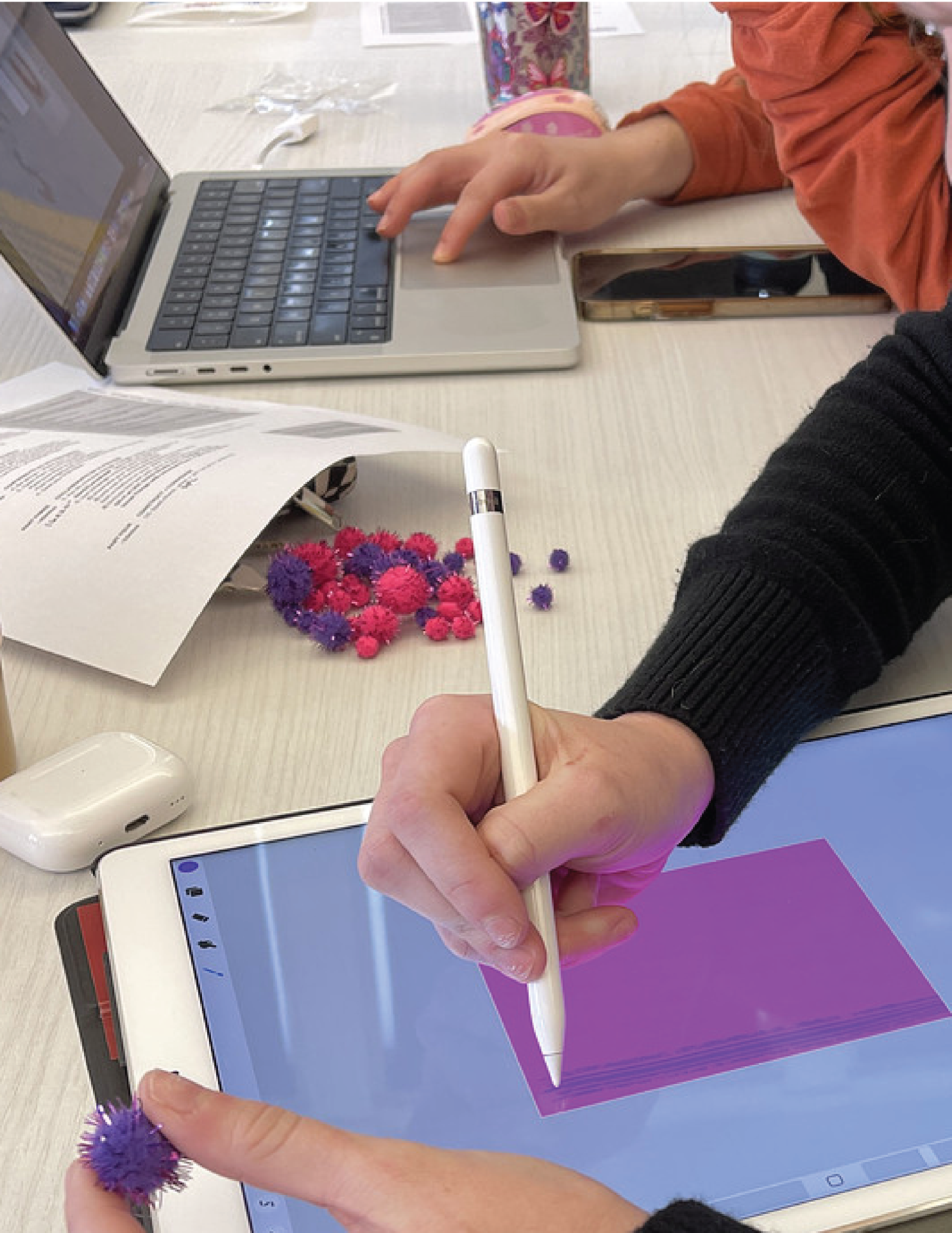
Processing the design

Photographing
Final Result